Finished cover artwork for the proposed Badger story
Introduction
In this episode I will discuss how I created a full color illustration for a comic book cover. “The Badger” is a comic character created by Mike Baron and published by Capital Comics in 1983. It ran for around 70 issues until 1991. Since then the character has appeared in print with new stories under various publishers. In this blog episode I will explain about my creating a cover image for a newer story that was being pitched to the current publisher, Devil’s Due/First Comics.
This story involves the Badger and his canine friends entering into the Alaskan Iditarod and having an adventure that would involve a Yeti and a Kodiak Bear. These characters were to be used for the cover as well as a pack of dogs and their sled and our hero. The Badger and his team would be out in the wilderness and threatened by the a fore mentioned Kodiak Bear. And just for more visual fun a Yeti would be seen somewhere as well.


Thumbnails
The Thumbnail Stage
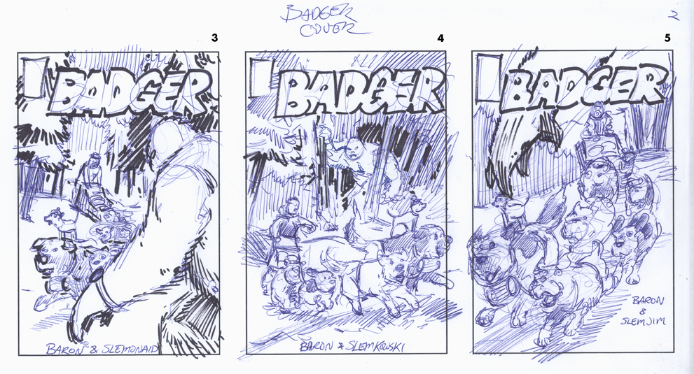
The first stage to this type of project, and any other illustration assignment for that matter, is to come up with some thumbnail sketches to get an idea of how these elements can be put together in a logical format. This is usually a fun stage because the point is just to put down whatever comes to mind and not worry about the details. If it’s not coming together the way you feel it should then you can just jump onto the next one.
And so on and so forth. In this case I had 5 ideas that came together one after another.
Typically, it takes me a lot longer and at times I go through many sheets of paper before I get something I like. To make the thumbs look more comic book like I dashed in a title and some cover graphics. It made the scribbles look like they had some merit. And it was fun to do. Thumbnail #5 was the layout that seemed to work best.

Final Pencil
Creating The Final Pencil
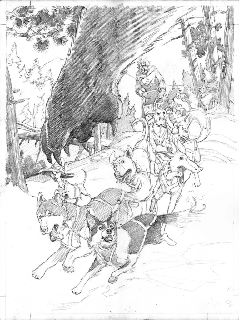
The next stage was to work up a finished pencil. Here I put to use a collection of dog reference from other projects that I had worked on. To make the image more interesting and fun the sled team would be comprised of various types of pooches. We would have a Chihuahua, a Great Dane and some other fun and interesting breeds that Mike wanted in there. Together they would make a colorful visual. I had to also think ahead of how to place them so they would contrast nicely with one another when it came to color.
Size also was a factor to consider. The pencil was done on a 20”x15” sheet of Strathmore 500 series rough bristol. It is good stuff and holds up well with the water media I was going to use which was gouache.

Color Comp
Creating A Color Comp
Once the pencil was approved it was now time to do a color comp. This too is a fun stage because if things go awry it’s no big deal to just do another one. I take the pencil image and run off some 11×17 copies that I tape down and begin to add paint over. Once the paper is dry it settles back down pretty well and is for the most part flat. Surprisingly, the paper can take a lot a scrubbing without tearing. This is the stage that I try to figure out how much pink and oranges should be used in the light areas and if it will look visually pleasing.
I’m trying to capture a sense of late afternoon light. The Golden Hour. A bit of pink and orange in the lit up snow will help in creating that look. The shadows, of course, would have blue cast to them. If it gets too strong with a certain color I just make a mental note about it so that it won’t be repeated in the final.

Badger Comic Cover Under Painting
The Under Painting
If I get everything pretty much worked out in the comp stage then I can move on to the final painting. Since I’m using gouache and will try to work it in washes I do a under painting first. This is done with Ivory black to establish where the darkest darks will be as well as the light shapes and middle tones. Values were pretty much done in the color comp stage so now they can be refined in the actual under painting stage.
I went as far with it as I thought I needed to. Some parts of the dogs I would deal with in the application of color. As long as the basic shapes are established I’m good to go.

Badger Cover- Painting Progression I

Badger Cover- Painting Progression II
The Application Of Color
In a way, once the actual painting starts most of the problem solving has been done and it’s pretty much downhill from here on. It’s just a matter of putting down the color and moving on to another area. A general rule of thumb in painting is to do the foreground shapes first. When finished they will dictate how the background should be handled. In this case I felt it would be easier to work from the back and go forward.
The sky was what was done first as I put in some light yellows and worked up with the pinks and oranges. To let the darker colors remain where they should while drying I would have the image turned upside down. Due to the angle I had the support resting on the drying paint wouldn’t drift into the lighter areas where I didn’t want it.

Badger Cover- Painting Progression III

Badger Cover – Painting Progression IV
Adding Color To The Dogs
The trees and background hills went into place after the colors of the sky were put in. I was trying to be conscious of the play of light. As items got closer to the foreground they would get darker but not dark enough to interfere with the foreground shapes. It’s now at a point where I will work on the dogs and then go back into the foliage around them and adjust what I think needs it. As the dog pack gets more embellished I also go to work on the bear’s claw and arm while adding whatever is needed to establish it as the darkest shape and keeping a good balance with the dark shapes that make up the dog pack.
More blues are added to the shadow underneath the dogs to establish it better and anchor the pooches a bit more in the format. Airbrush is added where needed with some warm shots of pink to the snow patches in the light and some blue to the shadow shapes. In the end it’s a bit exaggerated as far as the lighting situation goes. The shadows would probably not be that dark in real life but if it helps carry the overall image then I guess it’s okay.

Badger Cover – Painting Progression V
How Things Turned Out
So the cover was finished and I was happy with it. In the end the publisher shot it down for reasons that really didn’t have anything to do with what I made. That’s the way it goes in the comic biz. I took a chance based on the fact that story itself hadn’t yet been approved. And this cover was to help facilitate that end. It didn’t work out that way, though. There are no bad feelings about it as it now falls into the, “Well, at least I have a portfolio piece.” category.
To see more comic book related artwork you can check what is here on jeffslemons.com and comicartfans.com
Until next time.