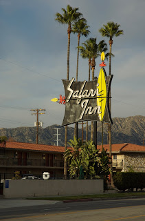
I want to stay one night at the Safari Inn. Maybe I will the next time I’m out in LA. Just look at that marvelous sign. It seems to declare “Adventure waits herein, weary traveler!” Looking at it, I have to wonder if marauding natives and wild animals of all sorts are lurking nearby. I can imagine the pounding giant kettle drums down in the courtyard under a moonlit sky while I lay on my tiger skin rug watching some TV. Yessiree, that sign paints some pretty vivid imagery in my mind. No doubt, if I really did check in, I’d probably just hear police sirens and runs to the ice machine all night long while I lay pondering the strange funk that permeates the room and why the bed sheets are itchy and look suspiciously unwashed in the glow of a worn, flickering TV screen. Well, cynicism aside, that beautiful, kitschy sign bathed in golden light fired me up. It’s the light itself that I wanted to capture some how. I had been kicking it around for a couple months now. I just didn’t know how I would go about it. I still didn’t at the time of getting this going. I chose to paint this right after completing the painting of Kuma the dog, the subject of my last post. Kuma took about 4 hours or so to paint. An hour after completion I began to work on the Safari Inn. I mention this because at this point something interesting happens. I had gotten one painting done that I felt pretty good about. I had a little brain fatigue but I thought I would plow ahead and see what could be done with a whole new set of visual problems to solve. The canvas measures 9×14 in size so I knew it wouldn’t take long to complete. So, the tiredness aside, because I was already “warmed up” with the previous hours of work it didn’t take long at all to get back into the zone and have some fun. This time around I was going to just shoot from the hip and see what happens. The sign is what I wanted to be the focal point and I wanted to get the overall painting down in a high key approach. That didn’t quite happen in the end, but that is how I started out.

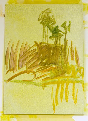
I wanted to get down many different colors all through the piece. It is a warm light in the photo and I remember seeing a bunch of colors all over the place that day. In the air, the mountains, and everything else I see color and more color. Okay, that said, how do I get that down on the canvas in some way that makes sense? I wasn’t sure. So, I just began to paint and solve that problem as I went. First off I put down a wash of Aureolin to get rid of the hard white of the linen. It is a yellowish type of color that is really wonderful. In what way? I dunno. It just has some aspects about it that really appeal to me. Not only will knock out the hard white but will also mix in with the color I put down thus “connecting” them. By that I mean, there is a little Aureolin getting mixed in with the other colors, thus connecting them. To be honest though, in the end I have put the paint down so thick that this may no longer be applicable as it would be if the color application stayed thin. Next, I put down the basic shape of the sign itself and the trees. The plan was that as I eventually got down to the lower portions I would break them down to simple shapes so the shape of the sign would remain dominate.

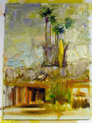
Once the darker shapes, the trees, sign and building, were placed I began to build up the color in the sky and hills. The hills I purposefully knocked down in value so that the building would stand out more. Because of the orange roof I have orange at random places in the sky and hills also. The blues and greens of the sky are also in the building shapes. Here we have some connection of color going on. This is a unifying tactic. It is a way to portray that all objects are bathed in the same light. Cadmium & Lemon Yellow as well as Aureolin have been used in the sky and other areas.

Here I have knocked back the trees and sign a little. As you can see the focal point has now changed. It’s going to be the dark shape of the building. I didn’t plan it that way but I didn’t care either. I chose to continue in this direction and see how it all played out. Warmer colors have been added to the sky. Pinks and soft oranges, which are also picked up in the hill. I have used the palette knife quite a bit at this stage. The knife is a fantastic tool that can pull off effects the brush can’t. The upper left and and far right are the results of the knife. As are the wall and driveway down below. Colors blend beautifully with the knife. It is also a lot of fun to use and experiment with. I’m pretty happy with how the overall piece has come together. At first I didn’t quite know how to wrap things to together. As I put down more color it started to click and I found a rhythm I was comfortable working with.

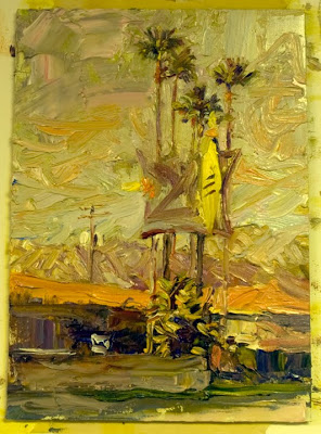
I made a few adjustments with the knife in the sky and proceeded to put in the sign’s letters. The roof on the left I blended into the hill shape behind it. I softened some other edges here and there and that was about it. It has a spontaneous feel about it that I like. It isn’t a high key painting that I had started out with to paint. This makes me admire those, like Monet, who make that type of painting look real easy. I would like to see if I can do a larger version of the Safari Inn and cut it out in the same manner. At any rate, two and a half hours later, a crazy looking sign has been put down on canvas in a suitably, wild manner that I hope captures the feeling I wanted to convey about it. A wild manner that still has some logic and thought put into it. I do think that jumping into this piece right after the Kuma painting did have some positives to it. I didn’t try to over think any thing. Afterwards I was definitely spent and would not have been able to do a competent third installment. So all in all, it was a good and productive day behind the easel.
Which is much more satisfying, I’m sure, than a night at the Safari Inn.