I’ve always been amazed by great black and white ink work. Well executed pieces done in pen or brush, or both, can be grand stuff. There’s a whole slew of embellishers in the comical book industry alone whose styles have fueled the fires of inspiration for me. Tony DeZungia’s inking on John Buscema’s pencils in Savage Sword, for example, seemed to make Conan even more of a force to be reckoned with. The dark shadows around the eyes always stood to me. Recently I’ve been flipping through my hard cover edition of “Earth X” which showcases the stunning work of John Paul Leon. It’s printed in just black and white and really makes a statement in regards to the man’s incredible draftsmanship. Solid blacks in the both the background and foreground fuse together creating beautiful effects of atmosphere. It is truly great work and worth checking out if you are unfamiliar with Leon’s art chops. This is how I decided to do things a little different on some comic pages I had to work on. Rather than use the brush to lay in the line work and manipulate watered down ink in various places like I had been doing, I thought I would rely more on the usage of solid blacks and see what I could pull off. Okay, enough blah,blah,blahing. Let’s see how things went these pages.
INK, BRUSHES AND WHATNOT

Usually I have 3 types of ink out to be used. For the darks I use undiluted “Super Black India Ink” by Speedball. This is really good stuff. Once it’s down and dried, the pencils can be erased and the inks sheen isn’t really dulled down. I like this stuff better than “Black Magic”, which I had been using for quite awhile.
Next, is a watered down bottle Pelikan “Drawing Ink A”. I have several bottles of this type that has lain around in a drawer for years. To the point that the pigment a globbed up a bit and had to be diluted to break it up. In general, this bottle is watered down so it isn’t so dark. It’s wonderful for toned effects.
Lastly, I have a batch of super diluted stuff that put into a plastic lid. Because of the dried ink residue that is never washed out, particles come loose that have cool effects when put down in a wash. Even though this time around I’m pretty much gonna just use the “Super Black” and a little wash effect here and there, I thought you might like to see the whole ink arsenal.
The brushes are Steve Quiller synthetics, sizes 2 and 5. The nibs are a 512, 513 and a fine tipped piece made by a Japenese maker. It’s for Manga type work but I got a bunch of them because they are good tools. The 513 was nib of choice for this batch of pages.
THE PENCILED PAGE
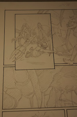
I pencilled out the pages on 15×20 pieces of Strathmore plate bristol board. I can see that I should have scanned these pages instead of just shooting them on the table. Next time I’ll do that, so please bear with me. On this page and the other three, I have a general idea of what areas will be the darks. There are places that I’m not sure about, so I just work those out in the back of my head while I concentrate on the areas that I do have a solid direction on. As long as I have a overall idea of how the page will lay out I trust the smaller uncertainties will just work themselves out as I go.
INKING
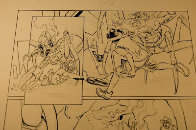
I used the 513 size nib to outline the shapes and their shadow areas. I’m not really doing any line work here such as crosshatching. I do this just to place the items in each panel and to start getting an idea of how I can pull the shapes in the back and front together. The 513, to me, has a nice feel to it. Because of it’s size it is less likely to get stuck in the paper and spatter. They do tend to wear out fairly quick depending on how hard you press down. How you hold it can also make it not put the ink down. In the end, you just have to get a feel for it to maximize what it can do. It’s like anything else I suppose.

Next I just laid down the darks areas and put in bits of actual line work here and there to create a sense of depth and to add some texture. There are still some parts that I know need some sort of treatment but what exactly that may be, I’m still not sure. So I move on to the rest of the page and leave these “unknowns” to be dealt with later.
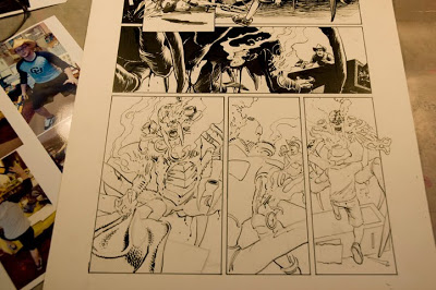
Here’s the lower portion of the page just in outline form. At this point I’m cruising along pretty good and I’m pretty confident in getting what I need to established.
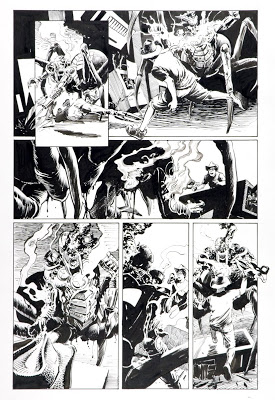
This is the finished page. I added some thinned ink in the smoke rising from the wounded mechanical creature
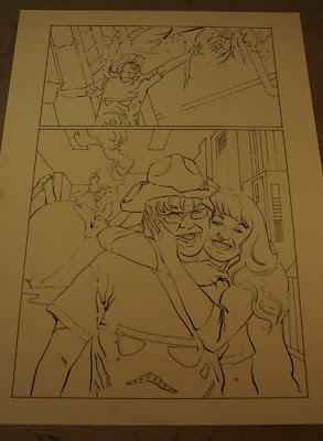
Here’s another page in outlined inks.
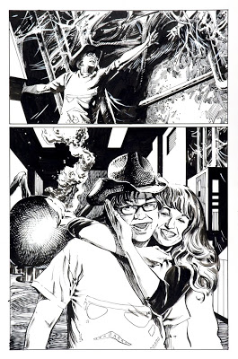
Once everything was in place, I went in with some white Gouache to put in some more webbing and break up some of the line work on the downed spider’s abdomen to accentuate the highlight.
On this page, my tendency to use line work came out a bit more than on the other pages. Sometimes it’s hard to turn off a certain way of working. That said, I still like the results. Hopefully the colorist can take these pages to the next level. For my part, I want to create a finished inked piece that can still stand alone by itself. Though far from perfect, I think these pages do that to some degree. If you would like to see them all, you can check them out at my Comicspace site with the link at the very bottom. The pages that I worked on for this post are pages 59-62. This particular comic will be an online item that will work in conjunction with a video game called “SCAPS Agent”. It should be green lighted by September of this year.