I’ve loved to draw dinosaurs for as long as I can remember. Up until the 6th grade I aspired to be a paleontologist. Mr. Ravenelli’s art class changed all that. It was there that I decided I wanted to be an illustrator instead. Getting paid to draw dinosaurs rather than digging them up in a dusty desert sounded pretty good. Plus, I could avoid any risk of heat stroke. So, about three decades or so later I get the opportunity to do the interior pages and cover to Mark Ellis’ new novel. Maybe for a future post I can put something up concerning the interior pen and ink pieces. The creation of the cover though, will be the topic of conversation for my first post. I will show my method of working and how I went about getting this assignment completed.
Initially, when all this started, a full color cover wasn’t even discussed. While doing the interior pages I started kicking around ideas that would possibly make for an interesting cover. Now I’m a real sucker for a good cover. I’ve bought bunches and bunches of comics just for the cover art alone, done by the likes of Alex Ross and Marko Djurdjevic, to name a couple. There’s just something magical about a well done cover. Case in point would be the illustrations that graced the Conan paperbacks by Frazetta. Those stories were all the more alive to me due to Frank’s art being stuck in my head. Gregory Manchess did a beauty of a cover for the latest printings of REH’s sword swinging barbarian. James Bama’s, “Doc Savage” covers are another fine example of work that just brings life to the printed pages between the covers. This type of work is a bygone era, I think, due to the digital age and all the change it has brought. Robert McGinnis and John Berkey are couple more greats from a list of many who’s work I find engaging and really well done. With all that said I aspired to create a cover that would live up to the merits these guys executed so well. I’m not sure I did that in the end exactly but I did have a lot of fun with this piece. And why shouldn’t I? I was getting to draw dinosaurs.
Step 1 – Thumbnails
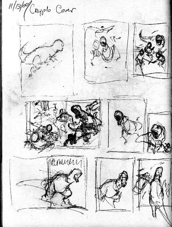
As is usually the case when I get an assignment or have something I want to do just for the fun of it, I start doing thumbnails in a sketchbook. This is a necessary step that helps the artist figure out what can work and what will not. Also, it helps the intuition kick in and you can end up doing some really nice line work that captures the feeling or mood that you were going for. The trick will be to later recapture that when you start to build up that particular thumbnail into a bigger and more evolved layout. Very soon after I started doodling out ideas for the cover layout I started thinking it would be cool to do a wrap around cover. With this kind of layout I could showcase all the characters in the story and get a few more dinos in to boot. Also, if the interest was there after the book came out, it could also be a nice poster or print. I wanted a T-Rex to be the predominate figure on the front cover. He had to be in some sort of action pose that would hopefully get potential buyer’s attention. He would be a real ramrod smashing through anything that would get in his way. His quarry would also have to be in some interesting pose to convey the urgency of his or her situation. On top of all that I would also have to come up with a way to show the rest of the cast in a way that would be visually clean and not hinder the viewer’s eye in moving around the entire composition.
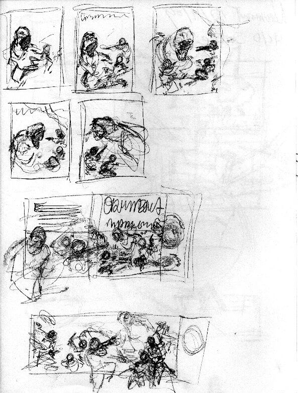
I went through about four pages in the sketchbook until I got something I thought I could work with and build up into something. The two images in the lower half are what I ended up with. At this time I thought I would have some extra bleed on the right that the viewer would never see in the printed cover form. Once it became a poster then that extra stuff would be seen. I had designed it to be in a widescreen format, which for whatever reason appeals to me. Jack (the lead character) and one of the ladies would be on the cover attempting to keep their cold blooded hunters at bay. What would be the back cover also shows the rest of the cast doing their best to keep alive as well. Well, this was a start anyway, so now it was time to move on to the next stage.
Step 2 – Pencil Roughs
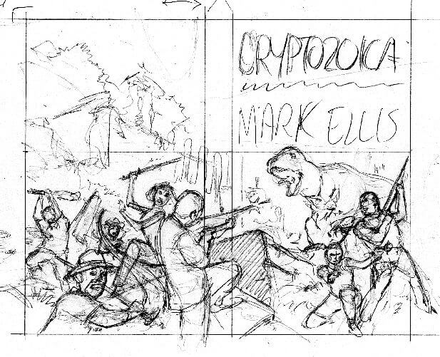
At this point I did an accurate layout of the cover’s dimensions and made several copies of it. One of which I sketched out loose concept on based on the final sketchbook thumbnails I did. I sent it to Mark to give him an idea of what I was thinking of. Nothing in this was set in stone. There was much more work still needed in getting to a good, workable composition. After sending him the above sketch I began to work all that out.
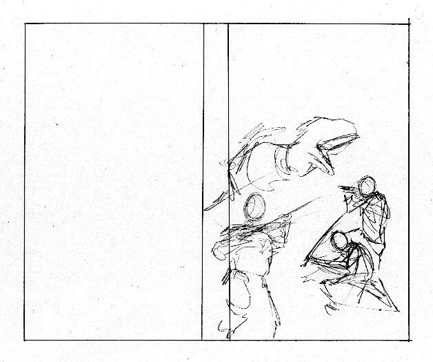
Now let me state that it has been my experience that I never can come up with a layout that never stops changing. I keep thinking of other things that may work. That said, the initial idea is still intact but evolving. The first rough I did I incorporated 3 people into the front cover. It had some aspects that I liked. So I continued on doing some more. A few were misses and some others I thought were getting me closer to my goal.
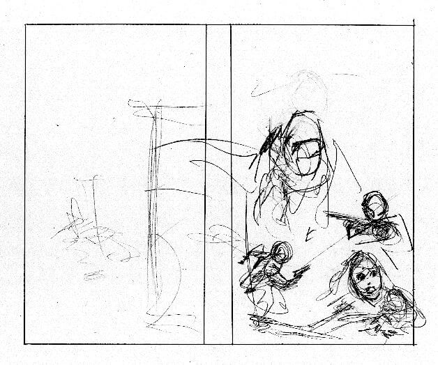
Same thing basically here in #2, just moving the people around a bit.
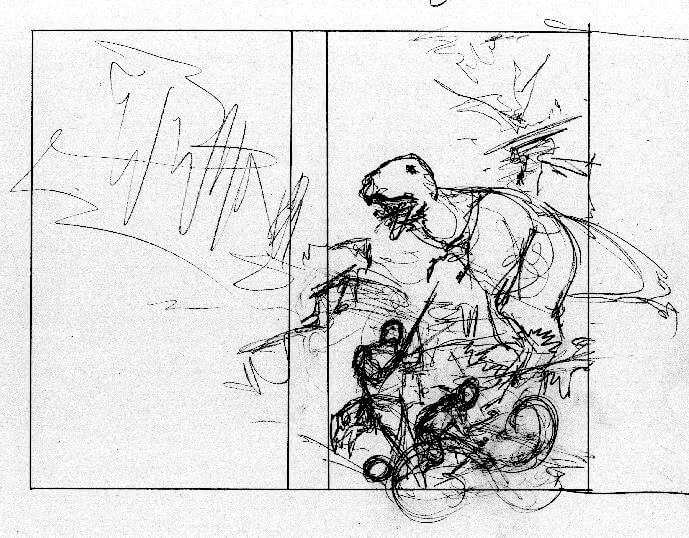
By #6 I’m getting closer to something I think that may work.
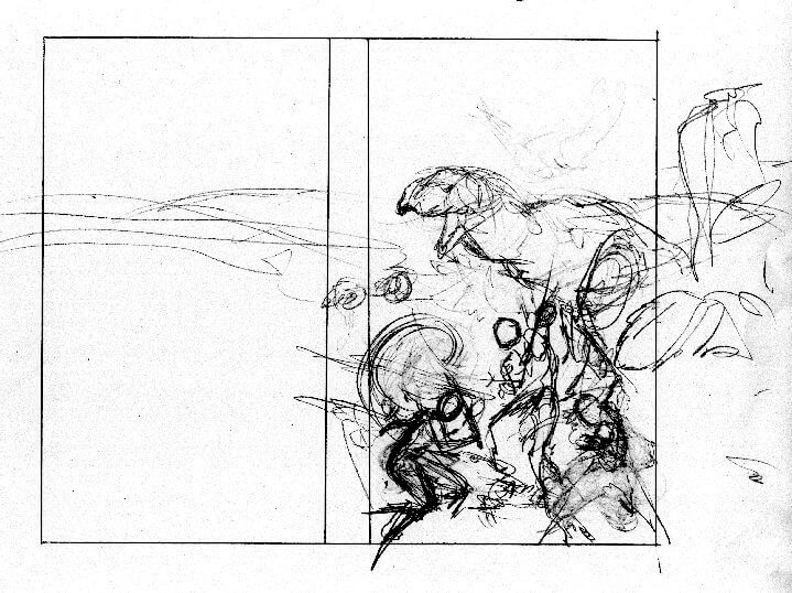
#8 has some things I like but, yet, it still isn’t clicking and I’m getting a bit frustrated. Something is there in the back of my skull, but it hasn’t appeared yet. What I do know is, is that there will be 3 figures on the front cover. Jack and two of the ladies. Just which ones is unclear at this point.
Step 3 – The Final Pencil
Now here is where I take an unconventional turn. In my mind’s eye I have a semi good idea of what and where things are gonna go. So I decide to just start laying out the final pencil on some illustration board. The board is double thick cold press Crescent board measuring 40″ across by 20″ high. I wanted to do a big piece in hopes that eventually it could be a big poster or print some time in the future. Also, I was still intending to draw the extra goodies in the bleed area, never intending for it to be seen in the cover version. This would prove problematic in the end. Normally, one does not move onto creating the final pencil until a layout has been decided upon. I’m taking a chance here.
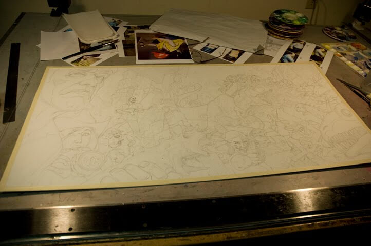
As I began to draw this out, everything started to click. The charging T-Rex is now coming in from a different direction. Just seemed right to do. I have also shot some photo reference to get an idea of how the poses will work with clothing and holding weaponry. Then I figured out how I wanted Jack and the girl next to him to placed. He sees the trouble behind them, she sees what is coming at them from the other side. I place the other girl close to the camera with a pistol drawn. Seems to be balanced. At this time I know I want a real big close up of the character on the far left and that he will be a dark shape in the end. I then find a way to get the rest of the crew in there and still keep it open enough so the viewer doesn’t get bogged down. On the far right I put in the charging raptors who basically are put into the area that is the bleed. I get it all drawn in and then make a copy to send to Mark to get final approval.
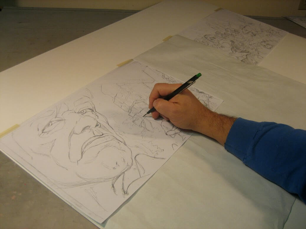
Now here is where things get interesting because of my decision to just cut to the final pencil without finalizing a set layout. Mark decides all of this should be on the cover. Which is fine. Because the layout is so wide, it creates spaces on the top and bottom that needs to be filled with new drawing. I transfer what I do have onto a new piece of illustration board. This time the size is 40″ wide by 30″ high. This going to be bigger piece than I intended. After transferring what I already had done I pencil in the new stuff. A little bit more along the top than the bottom to compensate for the title. The illustration is better off in the end, but all this time wasted redoing things would have been avoided had I stuck to the rules. Oh well.
Step 4 – Color Rough
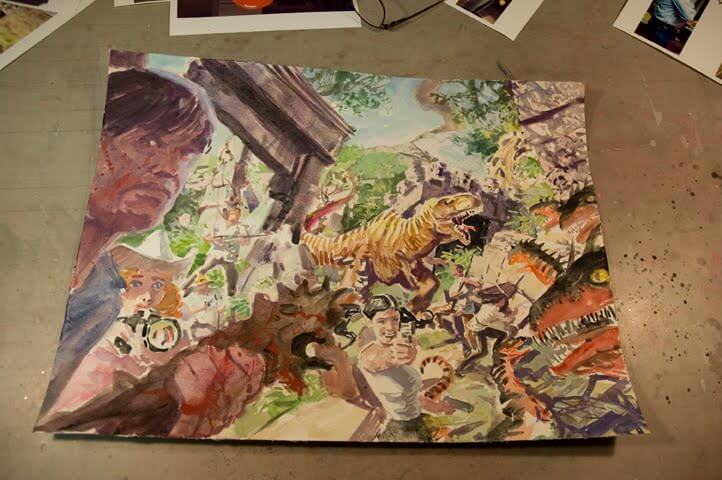
Before moving onto the final painting I want to get a good idea of what the color scheme as a whole is gonna be. So I do color study on a watercolor block. It measures 15 by 20. I don’t spend too much time on it because I still want to have “something” to pour into the final. I put the color down pretty loosely using gouache and watercolors. I solve various problems this way so I don’t have to figure them out while working on the final. This way I will know what can work and what may not. With that out of the way it is time to get to the main event.
Step 5 – Under Painting
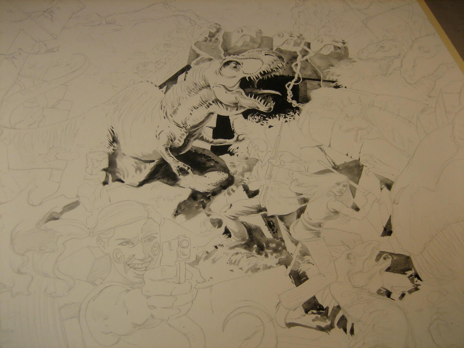
Sometimes I do an under painting. And sometimes not. In this case I wanted to do an under painting for the whole piece. After starting I realized that if I did I may not have enough energy to finish the thing. So rather than burn up valuable fuel I just painted in the focal point area and decided to just go directly to the painting. Time was also an issue. I wanted to get this thing done and move on to other work. For me it is best to get an assignment done as quickly as I can. If it sits around for one reason or another I can lose interest. Not so likely on dino art, but it can happen with other types of work.
Step 6 – Painting
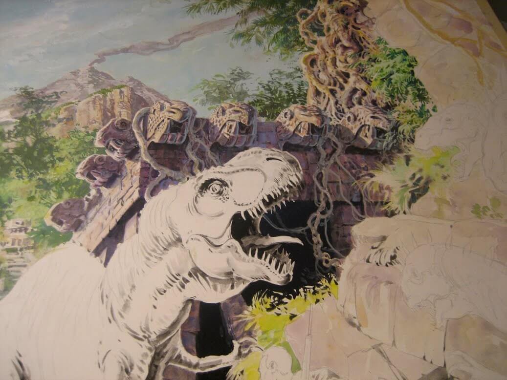
Normally I paint in the focal point first. Then paint in the subordinate areas. I’m using gouache and in this case I opted to put in the background and work forward around the focal point. This way I could create the illusion of distance easier. By adjusting my values appropriately as objects get closer, depth is created. I put in a light wash of naples yellow in the rock area to give it a look of warm sunlight. This will be built up as I go.
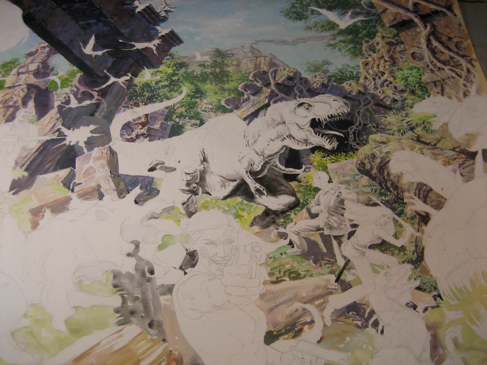
Here the rocks are pretty much finished. There will be some alterations to them as I paint in the figures. An area or shape may be made darker or lighter depending on what is next to it. The is done to create contrast and make a shape pop out more. I want to get more of the environment around Mr. T first before I start to embellish him. I know he will be some sort of sienna brown but that will fall into place easier once the components around him are established.
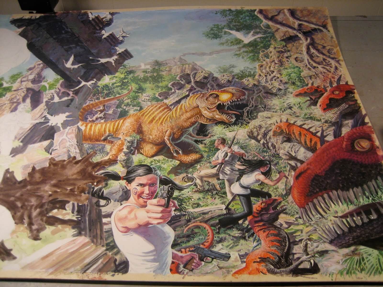
At this point it is pretty much down hill. The Tyrannosaur is fully painted and there is no missing him. You may notice that red and black patterns on the raptors are different here than indicated in the color study. After the study was done I realized that I had my color patterns mixed up. Now they are consistent with the interior raptor illustration I did. There’s always something.

This is the final illustration with a bit of airbrush in certain areas to give it a bit more atmosphere. The little pterosaurs were the last items on the docket to get painted in. I’m not sure how much time this piece took from start to finish but I think it is safe to say it was around 40 to 60 hours. And that is mainly due to the size of the art. I don’t normally work that large on commercial assignments. Anyway, the job got done and the client seemed to be happy with the final result. I can’t ask for more than that.